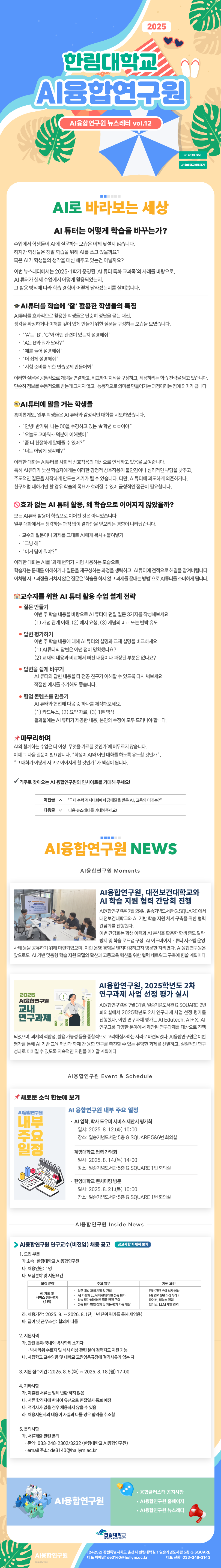
뉴스레터(제12호, 2025.8.11.월)_"AI 튜터는 어떻게 학습을 바꾸는가?"
- 작성자 : AI융합연구원
- 조회수 111
- 작성일 : 2025.08.11
 바로보기
바로보기  다운로드
다운로드
<style>@media screen and (max-width: 460px) { .stb-two-col .stb-column { max-width: 100% !important; } } @media screen and (min-width: 461px) { .stb-two-col .stb-column { max-width: 50% !important; } } @media screen and (max-width: 640px) { img.stb-justify { width: 100% !important; } } .stb-one-col p, .stb-two-col p { margin: 0px !important; }
</style>